Eloïse took our first year students on a print and typography tour in her Contemporary Issues lecture yesterday. First stop was Mainz in the 15th century where it all started with the Gutenberg Press and a discussion about how a technological innovation shaped and changed the printed page and in turn contributed to the dramatic cultural and social changes of the Renaissance period.
Staying in Germany but moving into the 20th Century for the next stop we looked at how politics and typography influence each other via the Nazi party and their struggle with Modernism and Nationalism with a case study on Paul Renner’s Futura and traditional Blackletter type.
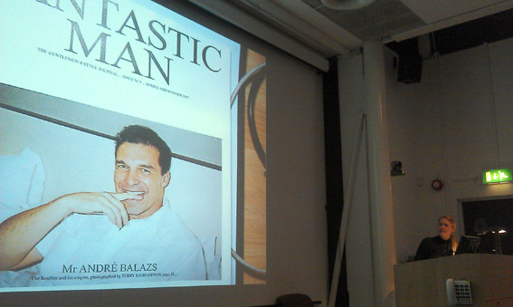
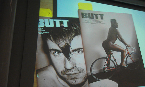
The final leg of the journey had a decidedly Dutch feel, focussing on the work of art director and editor Jop Van Bennekom via ‘Re-Magazine, Butt-magazine and The Gentlewomen. One of our essay questions requires the students to analyse a magazine, so we did a dummy run dissecting The Gentlewoman. By reflecting on who it is aimed at, looking at a selection of the editorial content and focussing on the layout, photography and typography certain themes could be teased out. It was interesting to see a contradiction between the mission statement of the mag “The Gentlewoman offers a fresh and intelligent perspective on fashion that is focused on personal style – the way women actually look, think and dress” and interview questions with Daisy Lowe that include: “What do you wear while doing chores? Can you describe the outfit? What’s your favorite apron? Do you clean up after house guests leave? Do you keep your bed tidy?”. Perhaps a good essay question would be — Who is the modern women being targeted by this new generation of fashion magazines?
Next week we’re off to Hollywood.