Working in groups our year 1 students were asked to find or generate data based on themes including travel, consumption and routines. They then had to visualise their data in 3-D using cheap accessible materials. The challenges and opportunities encountered during this process were discussed at the end and included; communicating comparisons effectively, the importance of clarity and simplicity, the relationship between the materials/form and the theme or subject matter, use of titles, annotations and keys. These findings will feed into a larger information graphics project that we’re currently running and will post up soon…
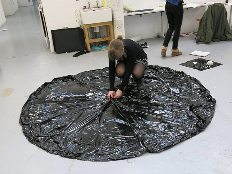
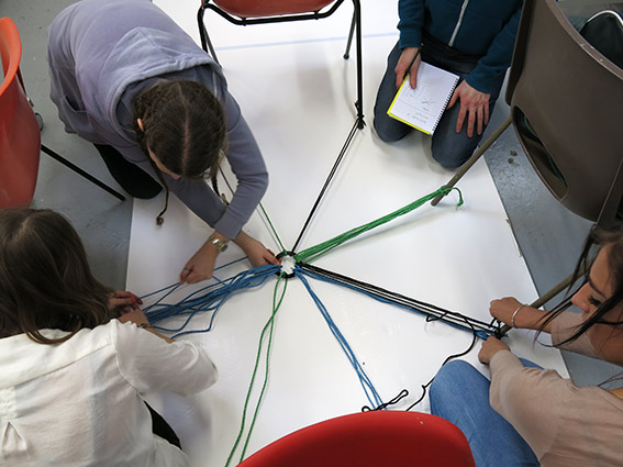
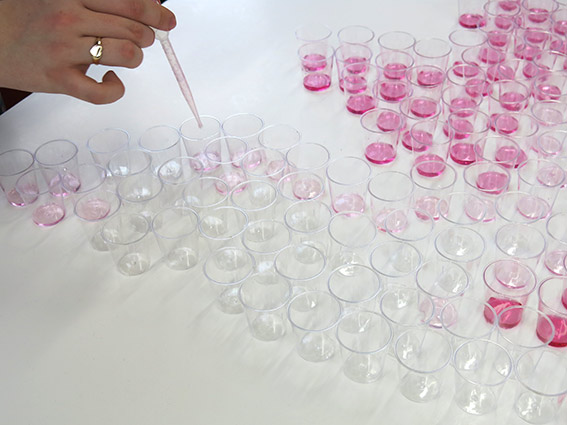
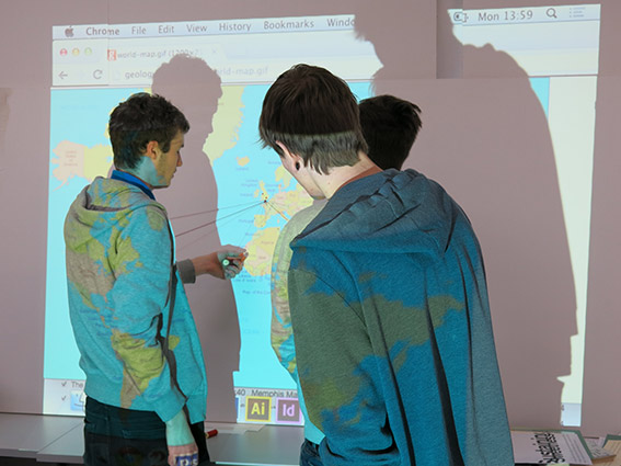
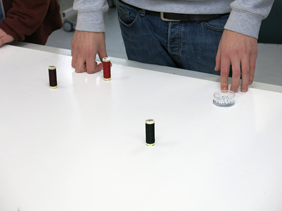
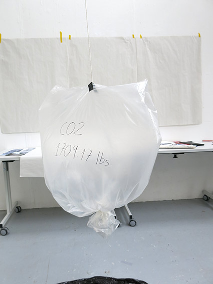
From top: Jessica Allen + team visualising fuel consumed on visits back to parents. Christiana Heckl + team using ropes to communicate quantity of mobile messaging to friends. Emily Barnes applying food colouring to plastic shot glasses to show alcohol consumption by region in the UK. Kit Debuse and others working out distances and destinations travelled on family holidays – eventually visualised with cotton threads. Finally, Joel Maynard et al showed us the CO2 generated in manufacturing all the phones they have ever owned.